AI App Builder
Switch to Design view using the
icon in the main menu.
AI is at the heart of Draftbit Next, allowing you to use natural language to instruct the AI what to build allowing you to create apps without needing to write a single line of code.
The Design view is your main work area where you can chat with the AI Agent, adjust component styles, preview changes in real-time, manage screens, and more.
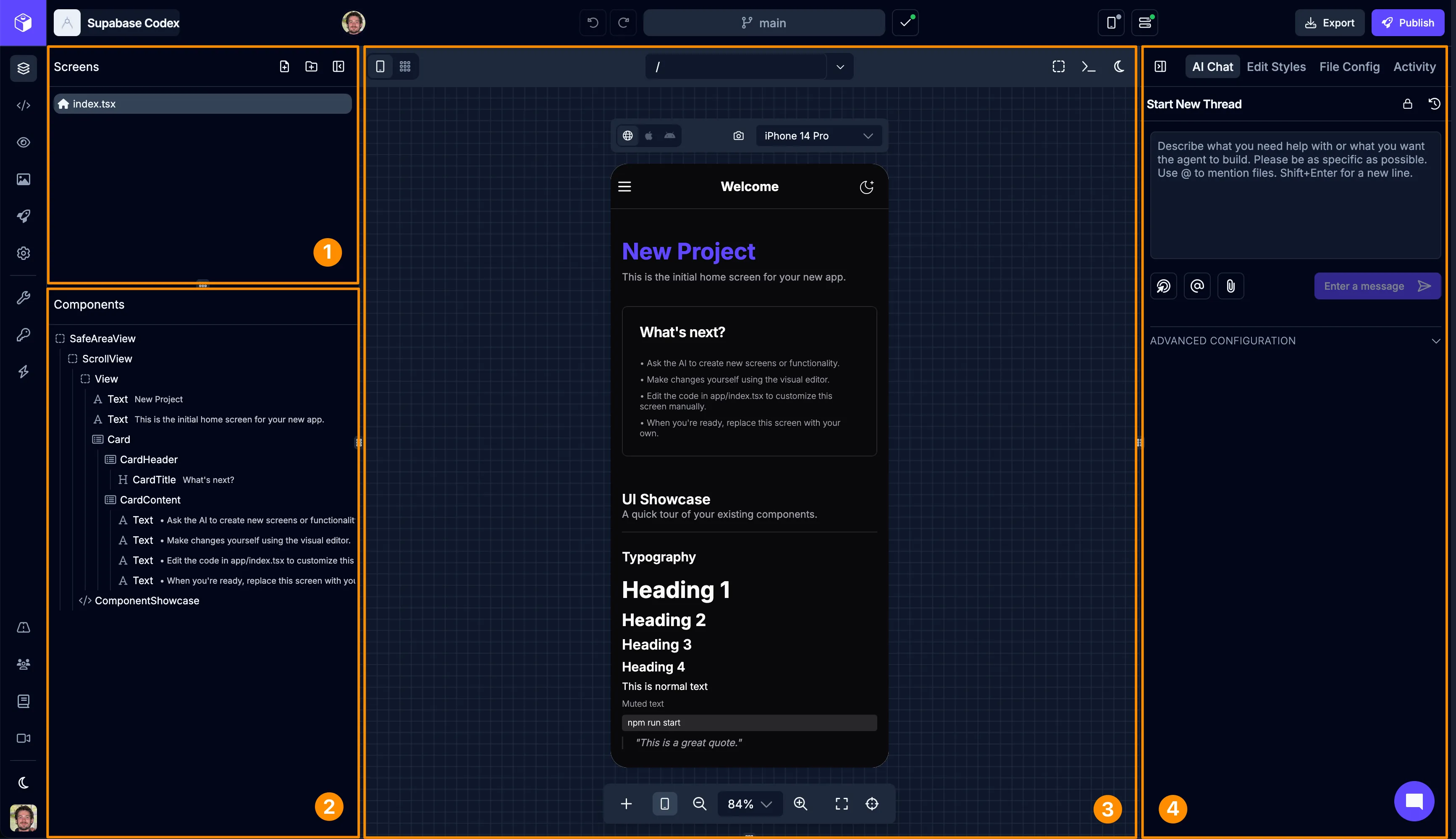
| # | Name | Description |
|---|---|---|
| 1 | Screens List | A list of all the screens in your app |
| 2 | Component Tree | The components used on the selected screen |
| 3 | Preview Panel | A canvas where you can preview your app on different devices |
| 4 | Utility Panel | Access AI chat, component styling, and other functionality |
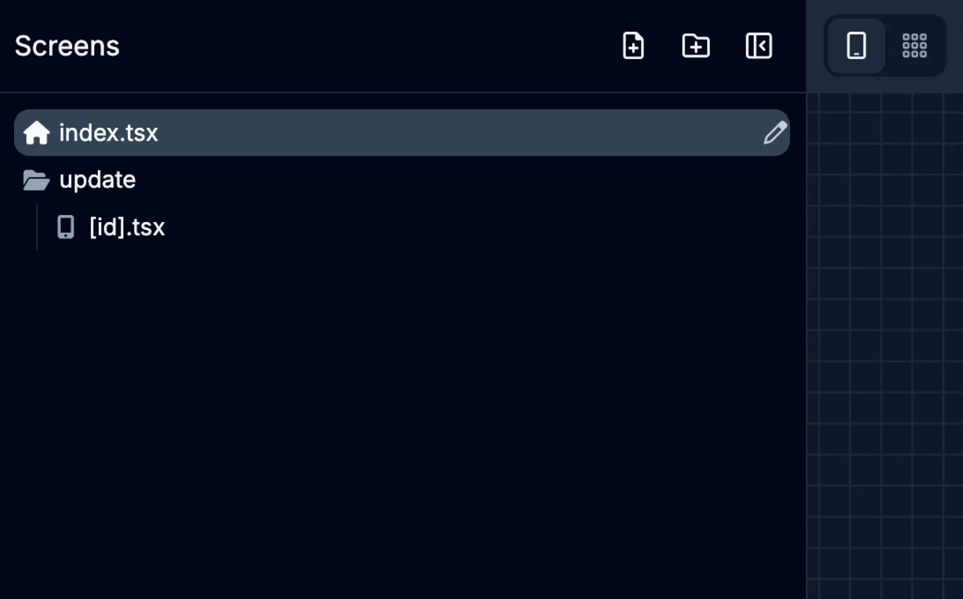
Screens List
Section titled “Screens List”Screens are the base element of your app and contain any number of components that make up the user interface (UI). Every app needs at least one screen. The screens in your app are listed here. You can also add more screens or folders directly. The Screens List is also where your app’s navigation structure is managed, since the way screens and folders are arranged determines the routes and flows available in your app.
| Icon | Action | Description |
|---|---|---|
 | Add Screen | Adds a new Screen to the app |
 | Add Folder | Adds a new Screen Folder to the app |
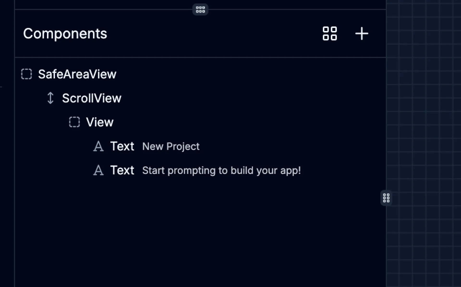
Component Tree
Section titled “Component Tree”Each screen is built-up out of smaller components in a hierarchy from top to bottom. Components can sometimes also be nested within/below another ‘parent’ component. The Component Tree is a visual representation of the component hierarchy on the selected screen.
From here, you can select components on the screen which will update the context of the Utility Panel on the right side of the builder - including the Style and Content tabs.
| Icon | Action | Description |
|---|---|---|
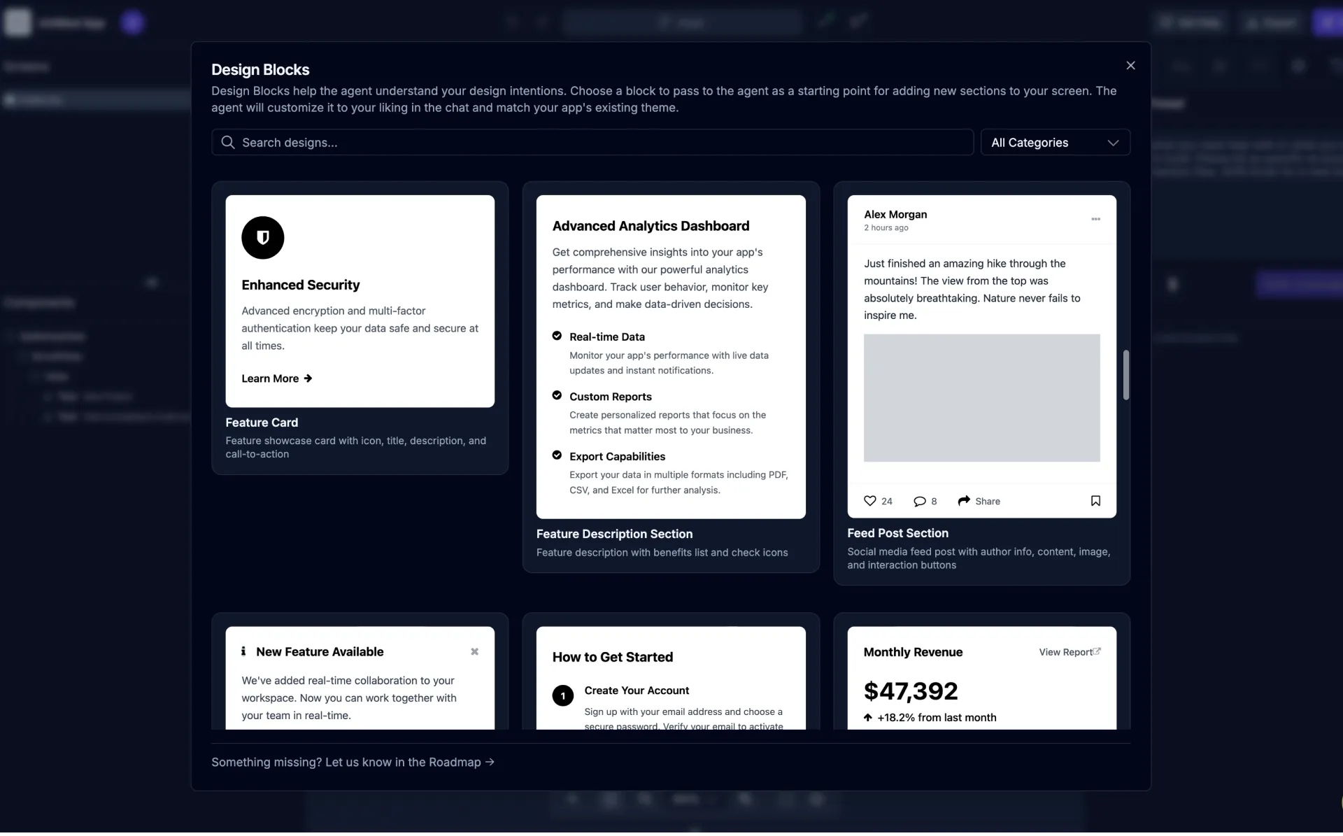
 | Design Blocks | Open and browse the Design Blocks gallery |
You can also open and browse the Design Blocks gallery using the button. Design Blocks help the agent understand your design intentions. Choose a block to pass to the agent as a starting point for adding new sections to your screen. The agent will customize it to your liking in the chat and match your app’s existing theme.
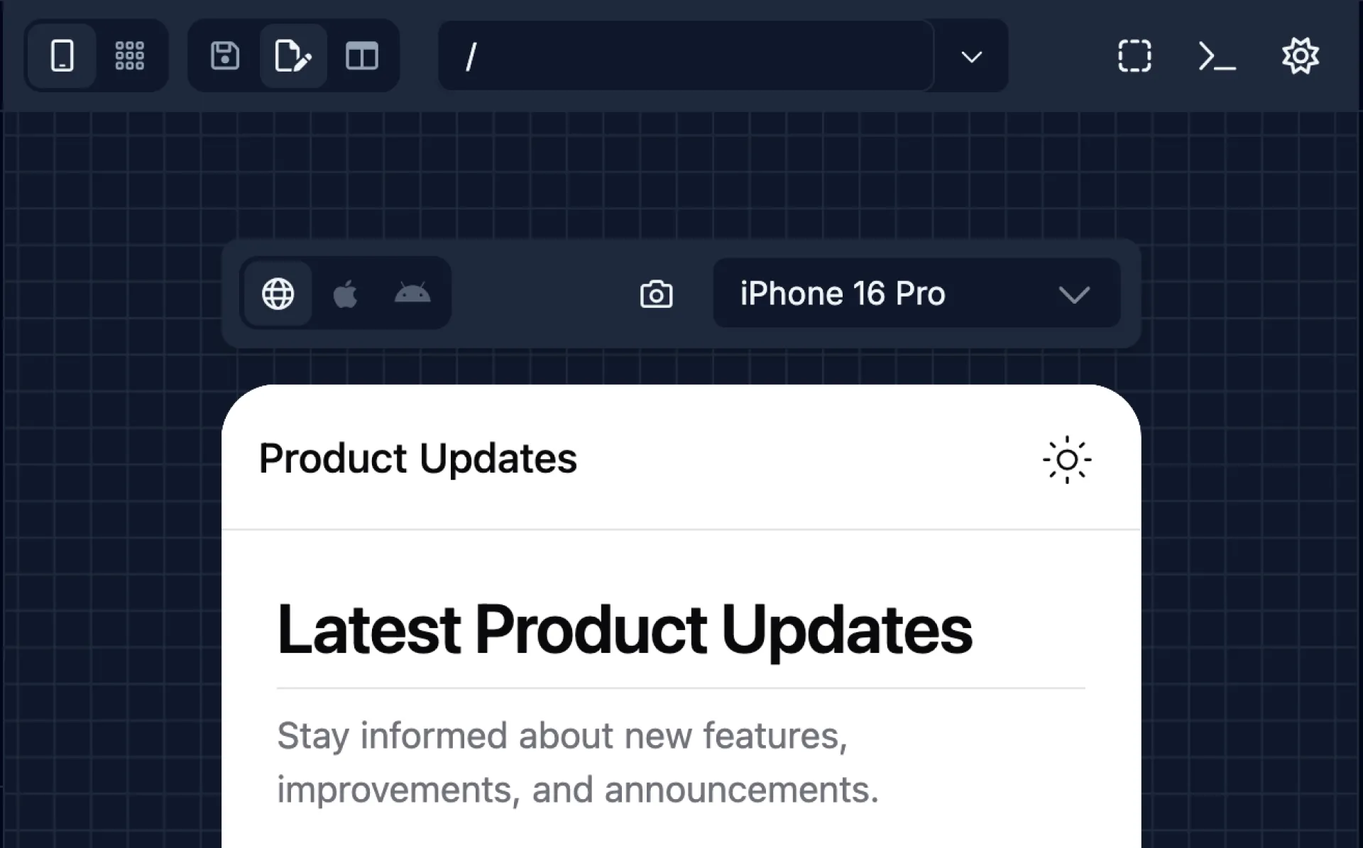
Preview Panel
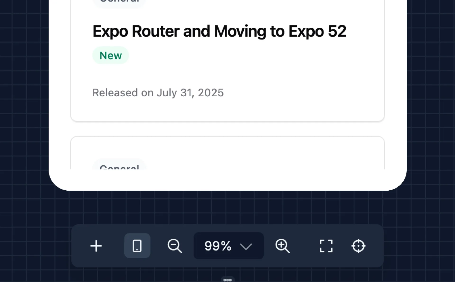
Section titled “Preview Panel”Draftbit offers a powerful app preview mode that lets you see and interact with all the screens in your app at the same time on an infinite canvas.
Within the Preview Panel in the center of the Builder, you can add one or more preview devices so that you can see changes being made as they happen in real-time on different types of devices. Pan and zoom to get a better view, choose between web (laptop/desktop) and native (iOS/Android) devices, change the device orientation (landscape/portrait), and switch device sizes.
| Icon | Name | Description |
|---|---|---|
 | Route View |
|
 | Enable Selection Mode | Highlight and select components inside the preview |
 | Show Preview Logs | View build output and errors while working in preview |
| Icon | Name | Description |
|---|---|---|
 | Add Device | Adds a new preview device to the preview canvas. |
 | Zoom Out | Reduces the level of zoom in the preview area |
 | Zoom In | Increases the level of zoom in the preview area |
 | Fit All Devices | Adjusts the zoom level so that all preview devices fit within the visible preview area |
 | Reset Zoom | Resets the preview zoom level to 100% |
Utility Panel
Section titled “Utility Panel”Within the Utility Panel on the right side of the Builder, you can access these features:
| Icon | Name | Description |
|---|---|---|
 | Chat Tab | Interact with the AI Agent to build your app. |
 | Styles Tab | Control the visual appearance and layout of the selected component. |
 | Content Tab | Update the content of the selected component. |
 | Code Tab | Edit the code of the selected component. |
 | Config Tab | Configure the selected component. |
 | Activity Tab | View commit history and other activity for the app. |
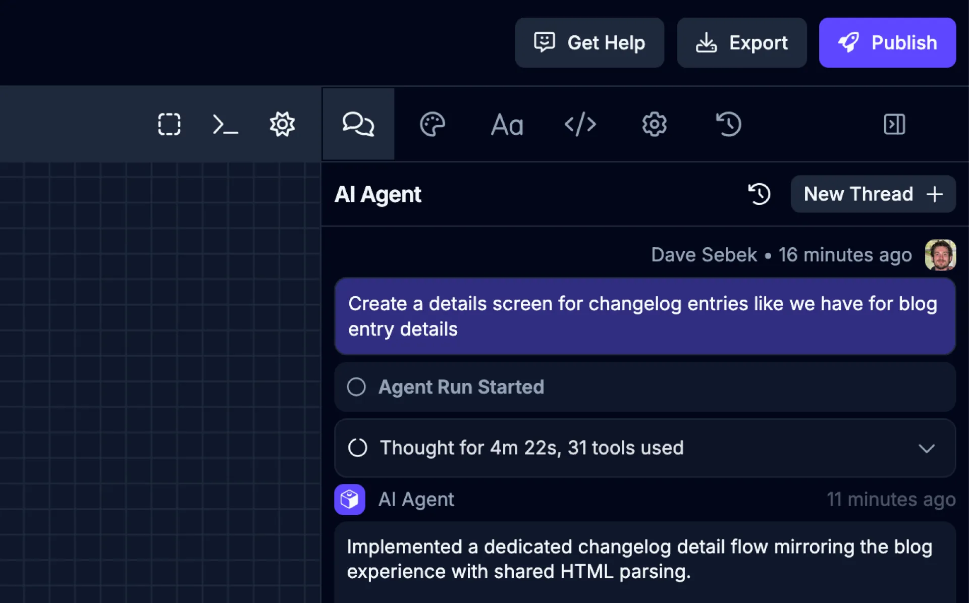
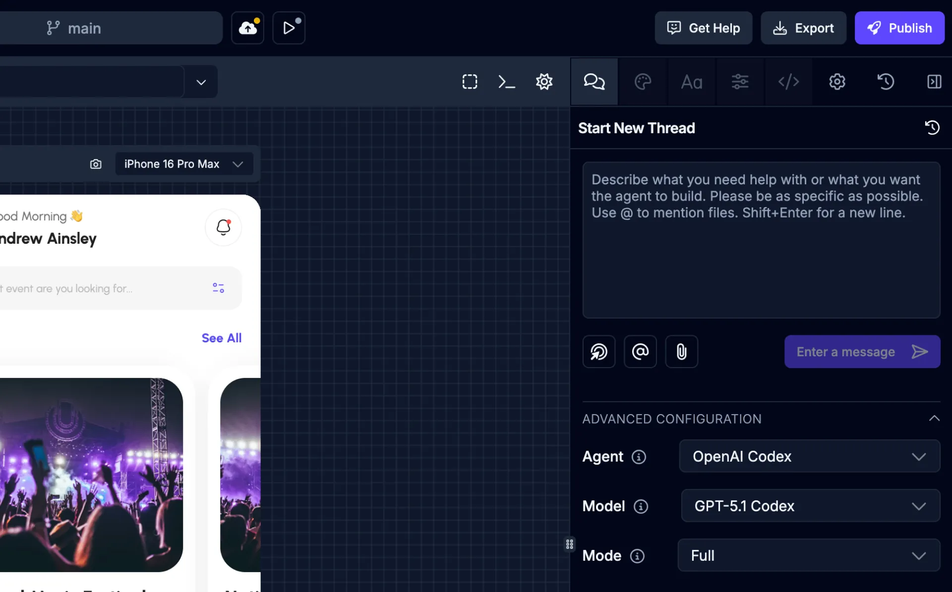
AI Chat
Section titled “AI Chat”Switch to AI Chat tab using the
The AI Chat tab in the Utility Panel is where you can interact with the AI Agent, giving it instructions on what to build in your app.
Create a new thread using the  button. You can provide additional context to the agent in your chat messages by including a specific component selection, file reference, or image attachment.
| Icon | Name | Description |
|---|---|---|
 | Add component | Select a component from the canvas to add it to your message. |
 | Add reference | Reference files and assets from your project in your message. |
 | Add attachment | Attach an image to provide visual context for your message. |
 | Add saved prompt | Use a saved prompt from the Agent Instructions view. |
 | Thead history | View and manage all your previous AI chat threads |
Advanced Configuration
Section titled “Advanced Configuration”The Advanced Configuration section allows you to configure the AI Agent and model to use for the task. You can select the Agent and model from the dropdown menus.
| Name | Description |
|---|---|
| Agent | The AI Agent to use for the task. Anthropic Claude Code (default), OpenAI Codex, Google Gemini (upcoming) |
| Model | The model to use for the task. Options depend on the Agent selected. |
| Mode | The mode to use for the task. Full or Read Only. |
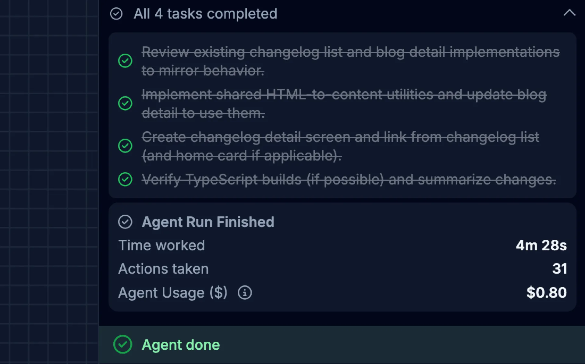
Agent Run Summary
Section titled “Agent Run Summary”The Agent Run Summary is a receipt of the time and actions taken by the AI Agent to complete the task you’ve assigned it along with the total cost.
| Name | Description |
|---|---|
| Time Worked | The total time taken by the AI Agent to complete the task. |
| Actions Taken | The total number of actions taken by the AI Agent to complete the task. |
| Agent Usage ($) | The total cost of the actions taken by the AI Agent to complete the task. |
Styles
Section titled “Styles”Switch to Styles tab using the
Use the Styles tab to control the visual appearance and layout of the selected component. Values map to NativeWind utility classes, and you can target specific responsive sizes using the Breakpoint selector. The top of the panel also shows Current Classes so you can review or add classes directly.
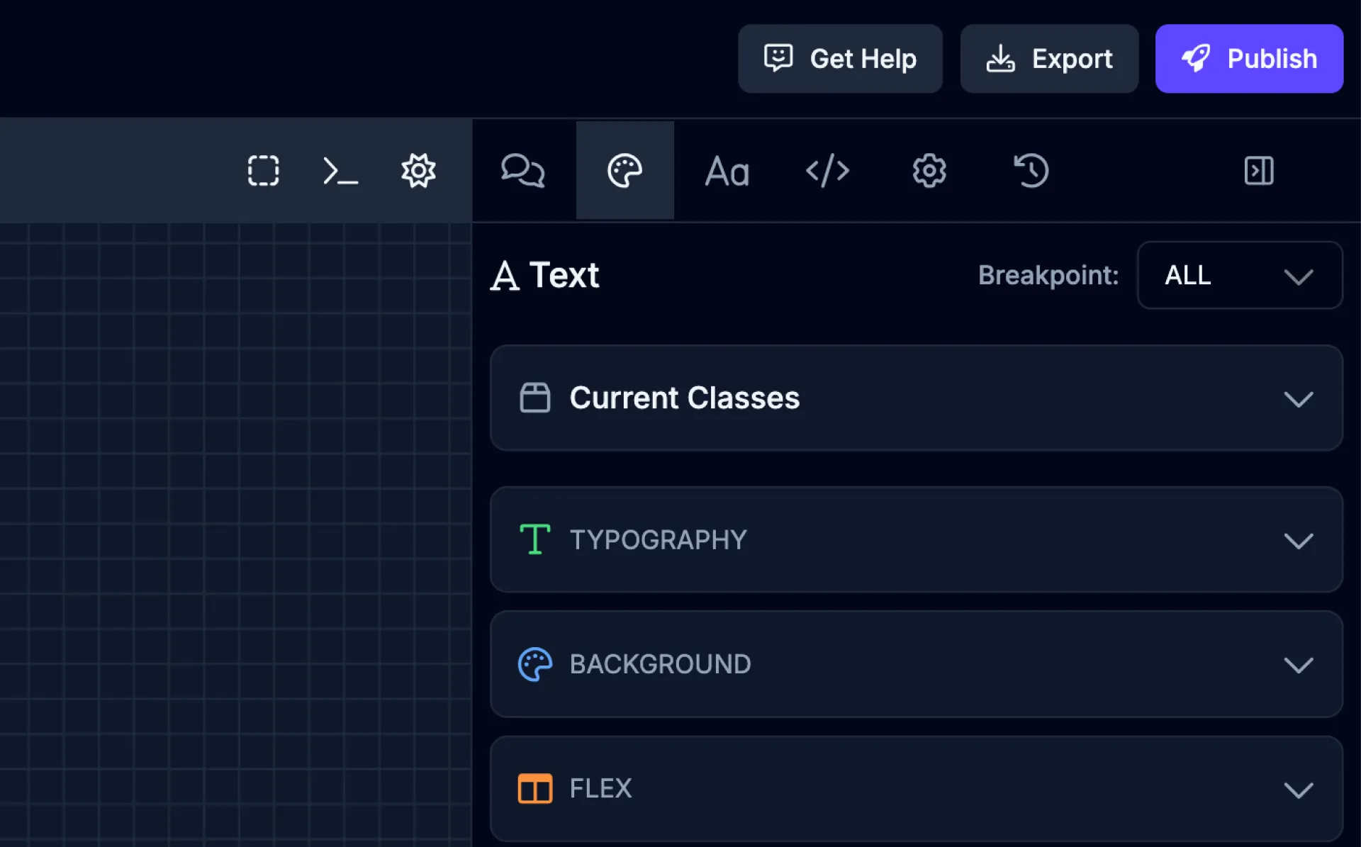
| Section | Description |
|---|---|
| Current Classes | View and manage the utility classes applied to the component. |
| Typography | Change the font color, size, weight, decoration, and more. |
| Background | Set background color and optional blend modes for overlays. |
| Flex | Enable flexbox and control direction, grow/shrink, gaps, alignment, and justification. |
| Spacing | Manage margins and padding, either overall or per-side. |
| Border | Adjust border width, radius, style, and color. |
| Shadow | Apply elevation by choosing a shadow size and color. |
| Layout | Control position, visibility, display, inset/offsets, overflow, aspect ratio, and z-index. |
| Sizing | Define height and width, including min/max constraints. |
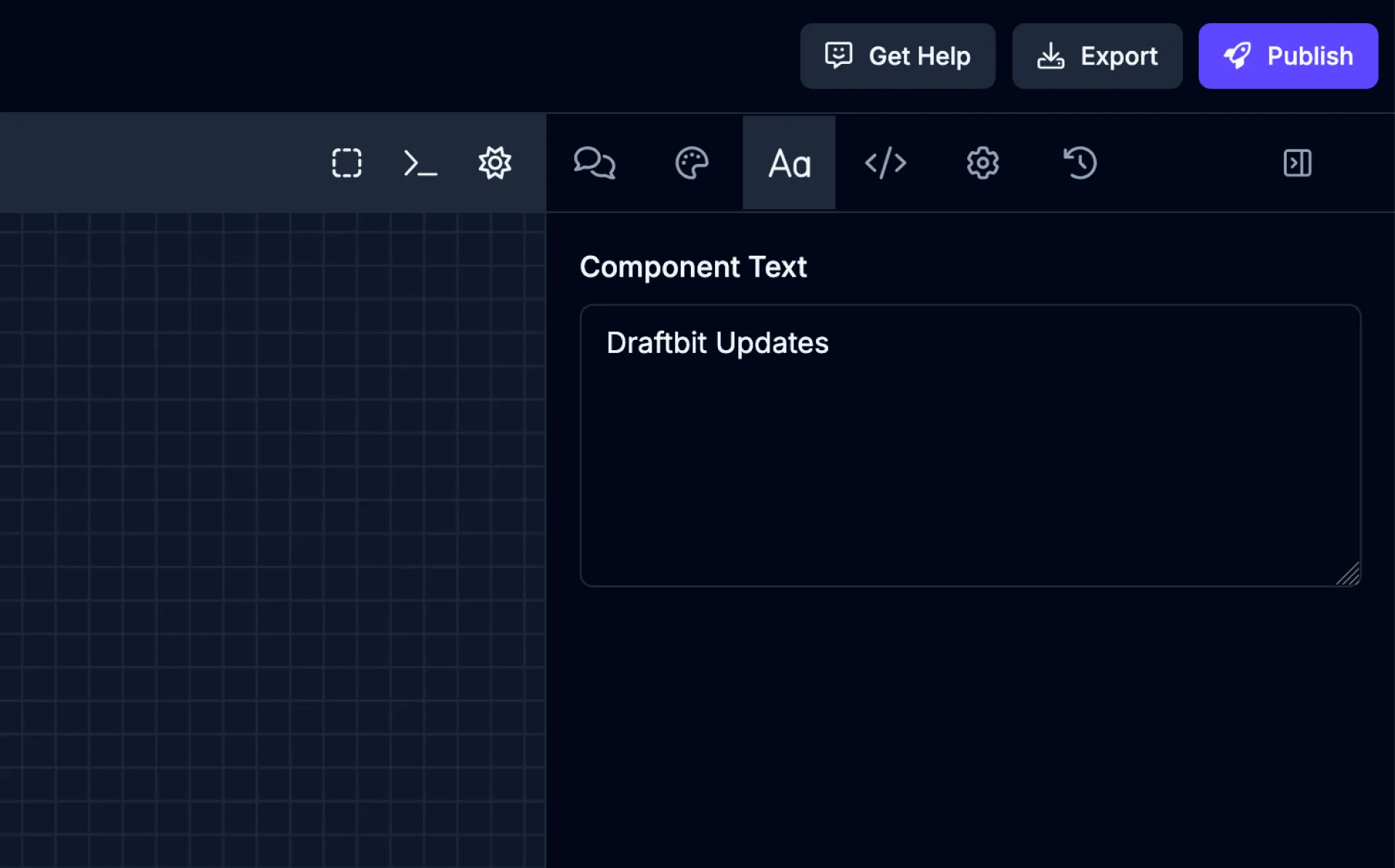
Content
Section titled “Content”Switch to Content tab using the
Some components, like Text or Button, accept a value. If you have selected a component in the Component Tree which can accept a text value, the Content tab will become available. This is a quick way for you to update the value without needing to ask the AI Agent or manually edit the file in the Code Editor.
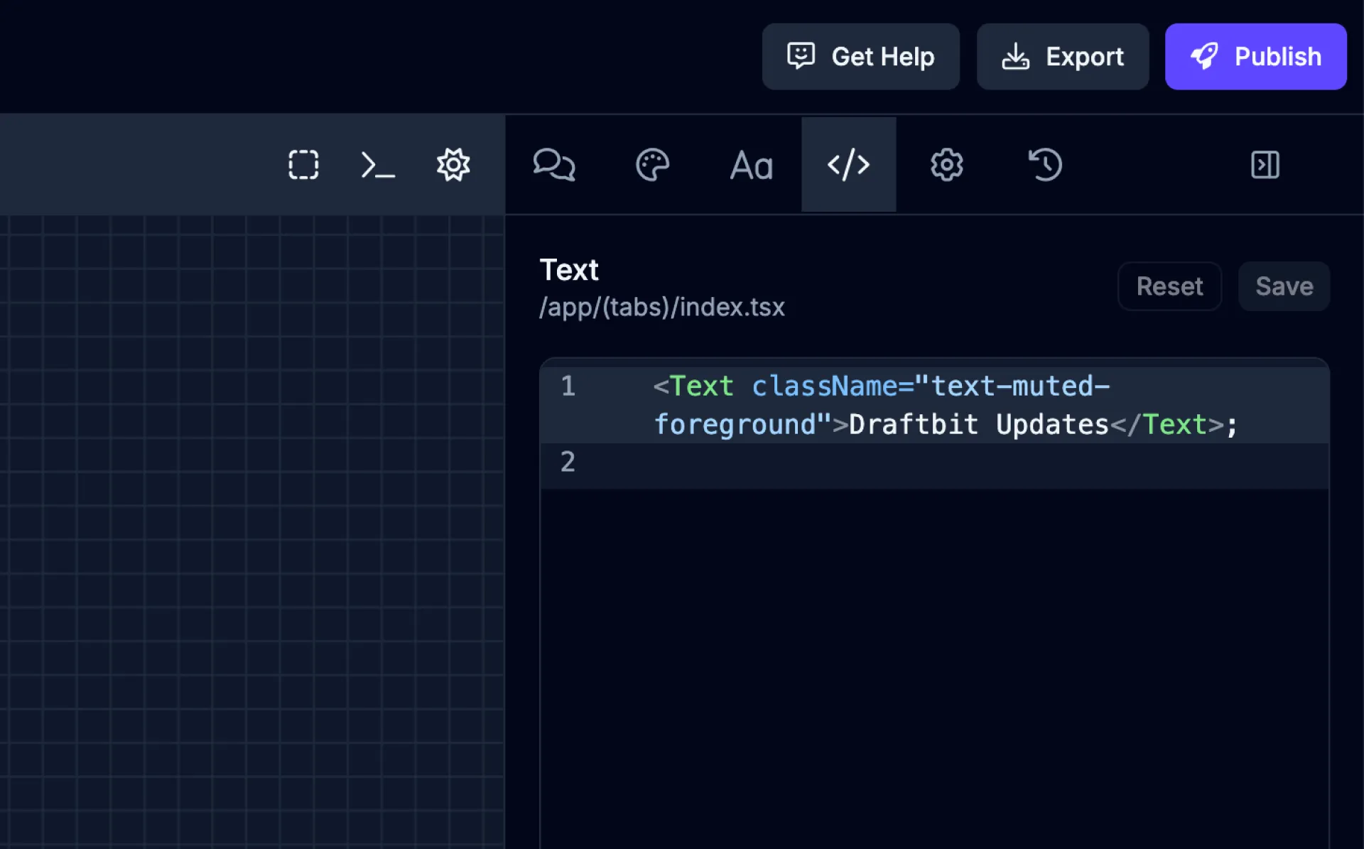
Switch to Code tab using the
The Code tab allows you to edit the code of the selected component directly in the browser. This is a quick way for you to make changes without needing to ask the AI Agent or manually edit the file in the Code Editor.
Config
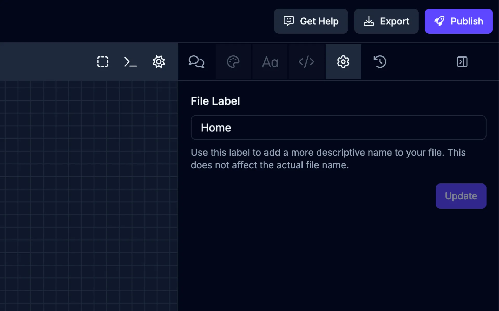
Section titled “Config”Switch to Config tab using the
The Config tab has additional configuration options depending on the selected screen or component.
| Name | Description |
|---|---|
| File Label | Use this label to add a more descriptive name to your file. This does not affect the actual file name. |
Activity
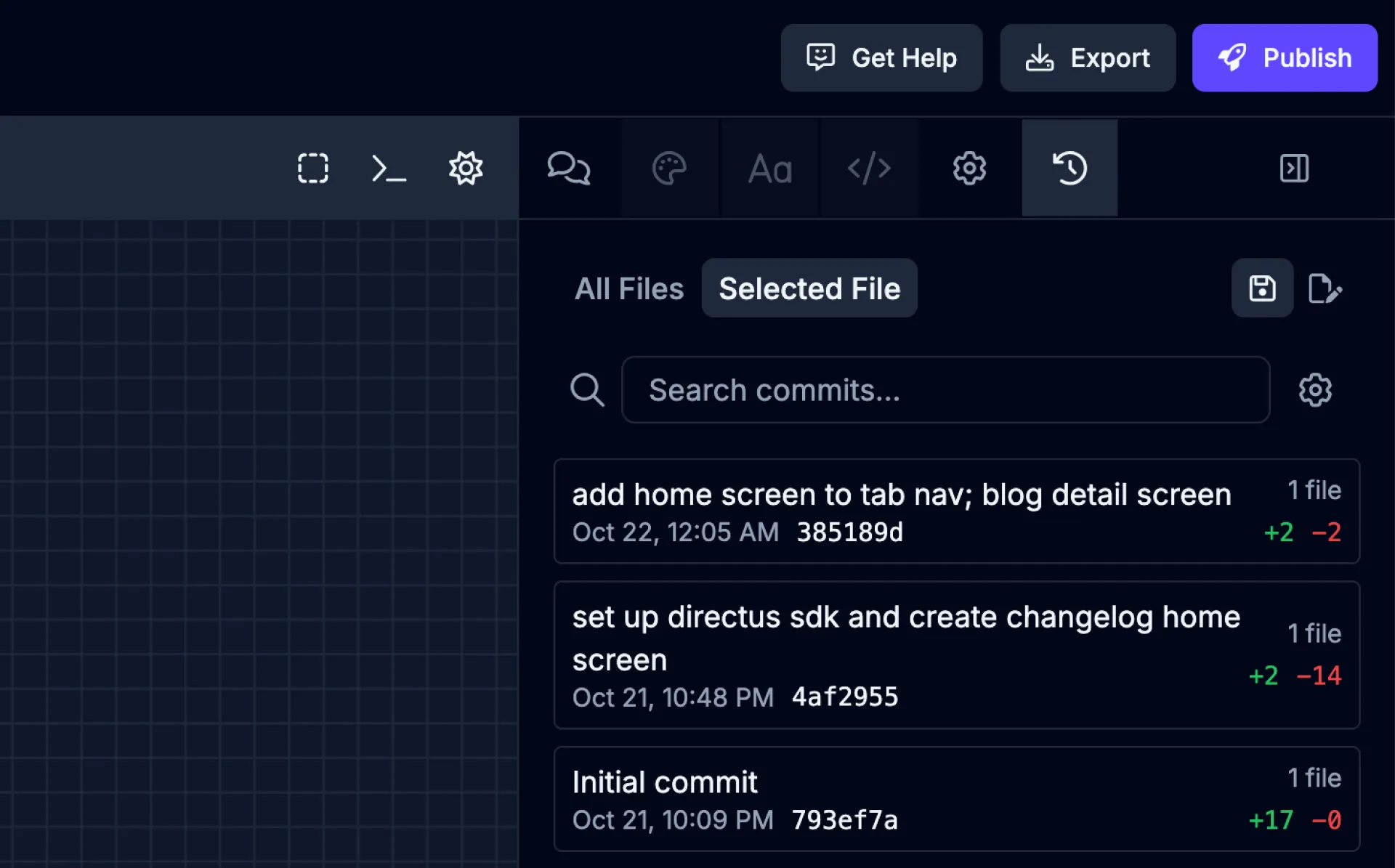
Section titled “Activity”Switch to Activity tab using the
The Activity tab will let you view and manage recent actions, events, or changes related to your app and its components. This can include AI agent actions, user-made edits, file modifications, and other important events within your project. The Activity tab also helps with accountability and collaboration by allowing team members to stay up to date with what’s happening in the project.
Saving Changes
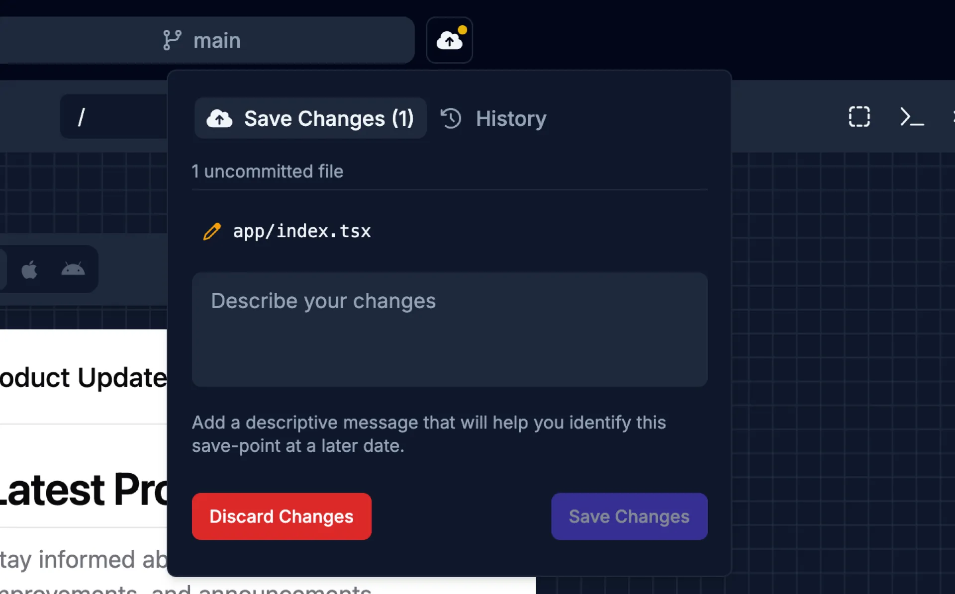
Section titled “Saving Changes”The Save button in the top bar of the Builder will indicate when your app has unsaved changes. Click the  icon in the top bar of the Builder to open the save options where you can choose to discard or save your changes.
Here you can add a descriptive message that will help you identify this save-point at a later date. Click the  button to complete the process.
If you’d like to discard your changes and go back to your last save point, click the  button to revert your changes.
Reverting Changes
Section titled “Reverting Changes”If you decide you want to go back to a previous save-point, you can easily roll back your changes. Click the  icon in the top bar of the Builder to open the save history for your app.
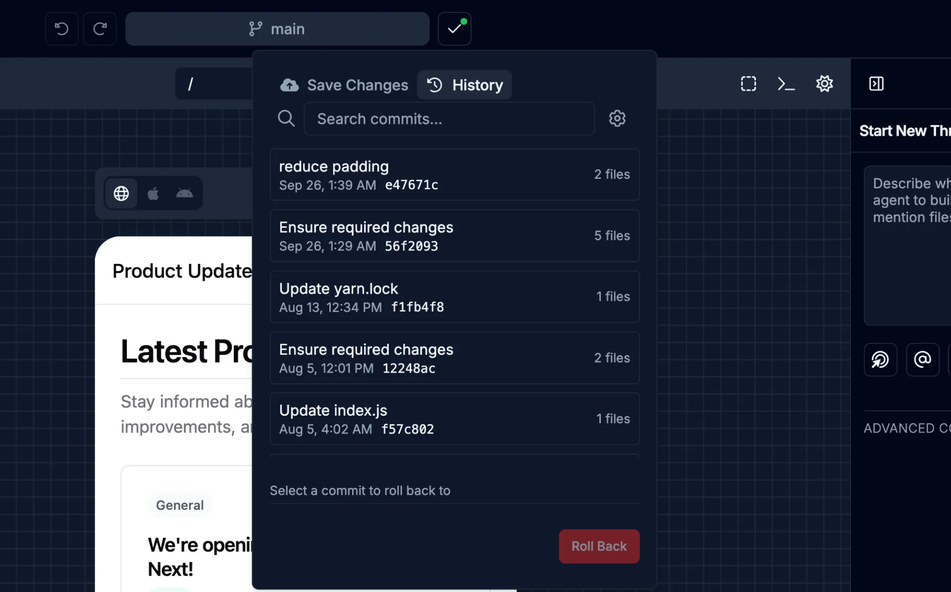
Here you can choose a save-point in your history and once selected will show you which files were changed at that time. Once you locate a point to restore, click the  button.