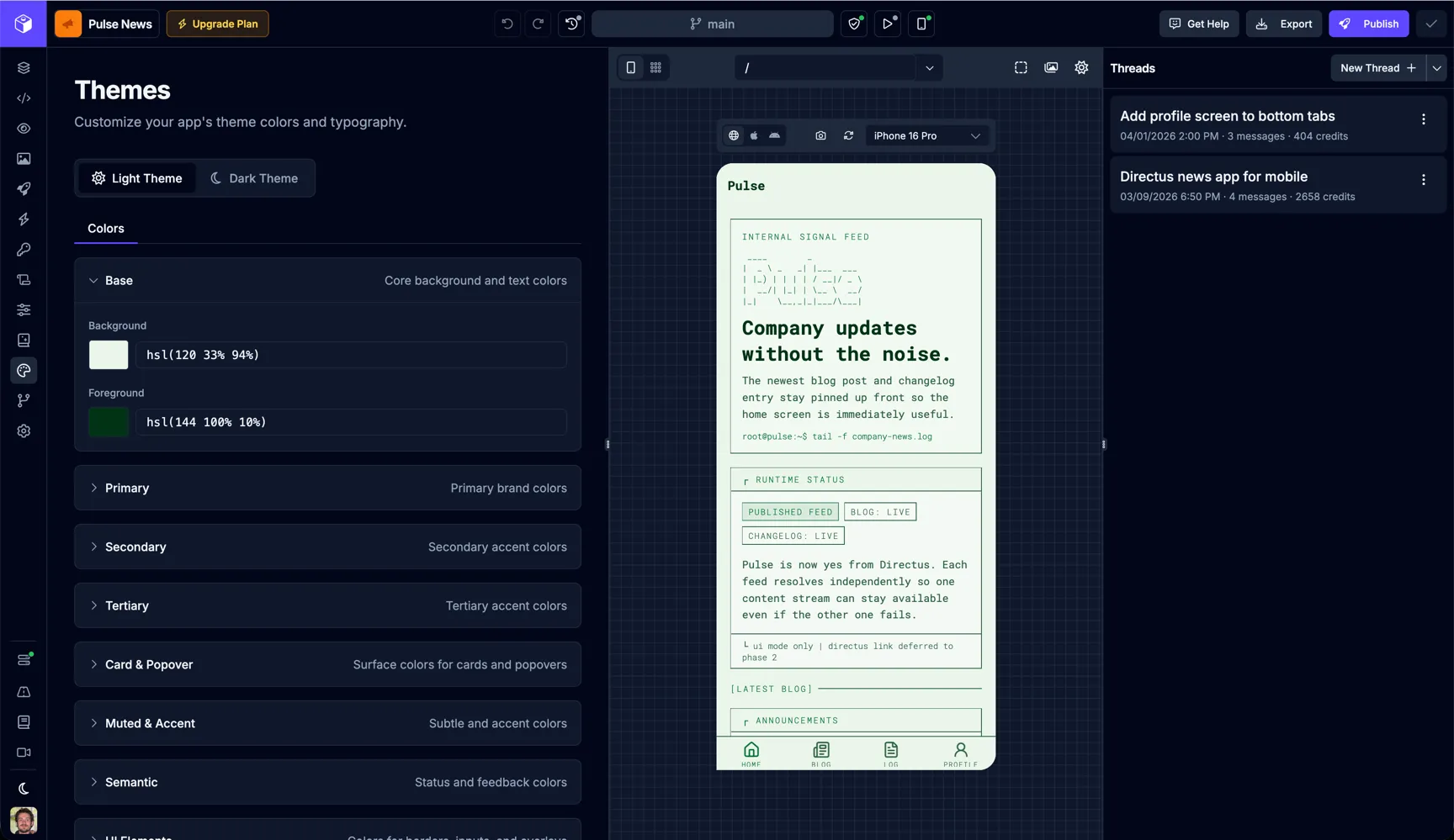
Themes
Switch to Themes view using the
icon in the main menu.
The Themes page is where you define the shared visual foundation for your app. Use it to manage app-wide theme values like colors and typography, then review the result directly in the Builder preview as you make changes.
Theme Modes
Section titled “Theme Modes”Draftbit lets you configure separate values for your app’s light and dark themes.
- Light Theme contains the values used when your app is shown in light mode.
- Dark Theme contains the values used when your app is shown in dark mode.
Switch between these modes at the top of the page to edit each theme independently.
Color Tokens
Section titled “Color Tokens”The Colors section groups related theme tokens so you can update your palette systematically instead of changing individual components one by one.
| Group | Purpose |
|---|---|
| Base | Core background and foreground text colors used throughout the app. |
| Primary | Your main brand colors for prominent actions and emphasis. |
| Secondary | Supporting accent colors for secondary UI treatments. |
| Tertiary | Additional accent colors for extended palette needs. |
| Card & Popover | Surface colors for layered UI such as cards, sheets, and popovers. |
| Muted & Accent | Subtle supporting colors for less prominent UI and accent treatments. |
| Semantic | Status and feedback colors for states like success, warning, or error. |
Editing a Token Group
Section titled “Editing a Token Group”Expand a color group to reveal the individual tokens inside it. For example, the Base group includes values like Background and Foreground. Update those values to change the shared colors used across your app.
The Themes editor supports token picking from your palette and custom one-off values. Apps imported from Draftbit Classic can also edit their imported v1 themes and palettes here. When you update a palette token, every theme value that references that token updates with it.
Typography
Section titled “Typography”Alongside colors, the Themes page is also where you manage shared typography settings for the active theme. These theme-level values help keep text treatment consistent across screens instead of styling each text element from scratch.
Use the Typography tab to edit font families, sizes, weights, and spacing. The font picker includes Google Fonts with live previews and wires the selected font into the right Expo or web configuration for your app.
Themes vs Component Styles
Section titled “Themes vs Component Styles”The Themes page controls shared, app-level design values. For one-off adjustments on a specific element, use the Styles tab in the Builder.
A practical way to work is:
- Set your core palette and typography in Themes.
- Build screens in the AI App Builder.
- Fine-tune individual components in the Styles tab only when needed.
This keeps your app visually consistent while still giving you flexibility for screen-specific design decisions.